Visualizing Data Flows at the Library of Congress
The following is a guest post by Lily Huang, a 2019 Junior Fellow at the Library of Congress. Lily worked with the Library’s User Experience team to create an animated data visualization of the data flow of the Library.
Coming to the Library as a Junior Fellow this summer, I was excited, but unsure what the Library did exactly… I was placed with the Library’s User Experience team and asked to visualize Library of Congress data flows for the general public by following User Experience (UX) Design principles. This meant learning how data comes into the Library, how it is processed, and how it is published for the public, while also clearly illustrating these paths.
Research
User Experience (UX) Design is a practice that seeks to fulfill the needs of the user while giving them a simple and enjoyable experience. The first step of the process is research. For me, research meant the task of starting from scratch to understand the many data flows at the Library. For the first three weeks, my mentor Natalie Buda-Smith, Design Division Chief in the IT Design & Development Directorate, and I interviewed various staff throughout the Library about their role, their work, and the tools they use.

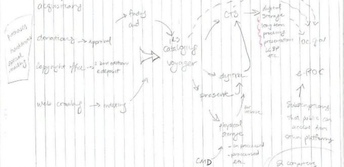
Mental model of Library of Congress data flows
While I learned about data flows, I sketched quick mental models that evolved as I talked to more people and collected increasingly specific information. When I finished the interviews and felt I understood the general flows of data at the Library, I brainstormed how to best display this information to the public.
Design
UX designers often create personas, or representations of the larger, target audience. I thought a persona from the general public would most likely know very little about the Library’s work behind the scenes. They would also find the description of various technologies and Library jargon difficult to understand, so a purely textual description of the Library’s data flows might not resonate.
My second design consideration was the amount of information I could fit into the visualization. Knowing the incredible complexity of the Library, I wouldn’t be able to include all the pathways a piece of data could take. I decided to simplify the flows down to the four main types of data, based on what I thought the general public might find interesting: analogue acquisitions, web archive acquisitions, data from Congress going to congress.gov, and analogue data coming from the Copyright Office.
There is no “typical” flow for any of these types – each object makes its way through the processes of the Library differently, and many objects can take years to process. My visualization would only address the ideal path of a flow, or how an object might be processed if nothing went wrong.
With these considerations in mind, I decided to create an animated map of the Library; a bright and engaging visualization that could easily catch someone’s attention. I pictured the map background as a static blueprint of all three buildings on the Library campus, with rooms in each representing each step of the data flow process. Rather than an accurate spatial representation of the Library, the map would be a way of reminding users of the physical steps data takes through the Library, and of the people working to process the data.
A user could press a button on the bottom of the screen to activate a data flow animation. Each data flow step would be accompanied by an explanation in a text box. When the user hovered over unfamiliar vocabulary, a definition of the term would appear. Having this separate “dictionary” feature also meant I could omit definitions, making explanations more concise.
Wireframing

Wireframe of final animation
Next I created a wireframe, or the visual representation of the interface. This was a static image of what I wanted the animation to look like in Adobe Illustrator. This allowed me to play around with graphics and colors without worrying about ruining any animations. The wireframe also made it easier and faster to develop the animation in Adobe Animate.
Then during Junior Fellow Display Day, I observed other Library staff and the general public interacting with the animation and noted the places they had trouble understanding or were confused in how to use the interactive animation.
From these testing sessions I made some significant changes. I added a blurb at the beginning to explain what kind of data I was animating for that flow, and a disclaimer that this was a very simplified version of the data flow. I also added underlines to distinguish words a user could hover over for the dictionary feature. Lastly, I numbered each data flow step to indicate when the animation was over and as a way to retrace steps.
Lessons Learned
The UX process creates and tailors a product to meet the needs of target audiences. I think it’s very easy to dismiss UX as common sense and to pass over some of the research and design steps. After working on the animation for seven weeks, I started to get overconfident. I was sure there wouldn’t be much left to change even after user testing. I was sure after all the considerations I’d put into the visualization, I had fixed everything there could be to fix. But with user testing I learned there was more to learn and adjust to make the animation easier to use and easier to understand.
I have only ever studied UX in school and read about UX design principles in textbooks, so it was a learning experience to put UX principles into practice. I now appreciate the user experience design process, and the importance of iteration and testing. I discovered there are always more improvements to be made, and there will always be something the designer overlooks. There will always be something that can make the experience of a product better.
Editor’s note: The workflow visualization that resulted from this exercise shows the promise of such an approach to understanding the flow of data through the Library from a birds-eye view. However, it is not a fully complete and accurate representation of the Library’s complex processes, such as the collections acquisitions process, as Lily’s focus was on making it accessible for those new to the Library and the complex work of Librarians.
Source of Article