Show and Tell
Libraries are complicated. They have a maze of departments, a specific method for retrieving books, and many rooms with different purposes: public and staff areas, service desks, and storage areas for materials, with varying access policies. Library signs can help guide users through this unfamiliar maze, allowing them to find what they came for with minimal anxiety.
Interior signage includes identification signs for service points, office room numbers, elevators, stairways, restrooms, entrances, and exits; directional signs; signs for orientation (call number ranges, floor directory); and regulatory signs (fire exits, fire alarm pulls). Exterior signage usually includes signs for site identification, entrances, exits, parking (and accessible parking), and directional signs.
At its most basic, a library signage system should have a directory at a building’s entrance to give users an overview of the layout. Directional signage along high-use channels also aids wayfinding. Identification signage can help users recognize different spaces in the library building, telling them what each space is for so they can find the space that meets their needs. Stack signage identifies call number ranges, allowing users to find and retrieve books.
Other types of signage—promotional, policy, and instructional signage—can help the user discover library services and resources, understand library policies, and carry out particular tasks (as when an instructional sign is mounted over a copy machine explaining how to use it).
Principles of wayfinding
The International Health Facility Guidelines (2016) establish the following wayshowing principles—or rather, means of guiding users’ own wayfinding:
- Create a unique identity of shapes and colors at each location.
- Give each region a unique visual character.
- Make use of sightlines.
- Create simple, intuitive paths that are easy to navigate.
- Make use of landmarks.
- Avoid information overload.
- Provide signs at decision points.
- Provide wall maps and printed material for users to take.
In interior spaces, particularly those where architectural cues cannot be added or changed, wayfinding designers need to focus on the last three principles—designing wayfinding signage and informational material that help users get from point A to point B. Users must be able to locate the entrance, exit, emergency exits, stairwells, elevator, restrooms, and permanent physical landmarks (such as beams, columns, a drinking fountain, a staircase, or an elevator) at any time.
Signs can be mounted permanently on walls to become architectural features, but of course this makes them difficult to move or remove. Other types of signs may be mounted on walls or ceilings to make them more flexible as building districts or collections evolve to reflect changing patron needs. Signs can be single- or double-sided, illuminated, or dynamic. All these types of signs can be helpful in a comprehensive wayshowing system designed to help library users navigate the space.
Designing effective wayfinding signage can be broken down into five steps you can use to see where your existing signage may need updating:
- Research your audience.
- Analyze the data.
- Develop a wayfinding document that maps out your users’ pathways.
- Select decision points.
- Select sign types.
Practical matters
The best practices of signage design, synthesized from the body of previous work on library signage and on effective signage more broadly, are detailed here.
Make signs succinct and legible. Sign text should be brief and maintain clarity; don’t overburden the user with too much information. Use active words, and make several passes at editing the text, continuously condensing your message without losing its meaning. Avoid library jargon; use plain language instead. Sign text must be legible from both a reasonable distance and up close.
Choose a sans serif typeface and avoid handwritten signs, which are often illegible and not compliant with the Americans with Disabilities Act (ADA), making them inaccessible to some users.
Keep user experience (UX) design principles in mind. Design thinking is a framework that comes from design-based research and is often associated with UX design. It seeks to understand the user’s needs and preferences through an iterative process that works with the user to identify problems and provide solutions. Every library choice should be intentional and have purpose. If you cannot identify the value or purpose of an element of your library (and particularly of a sign), then you may have to reconsider it.
Make text and visuals consistent. Because a signage system represents a whole network or family of signs, you should use consistent language and visual vocabulary throughout. All signs should share the same typeface, sizes, and color palette.
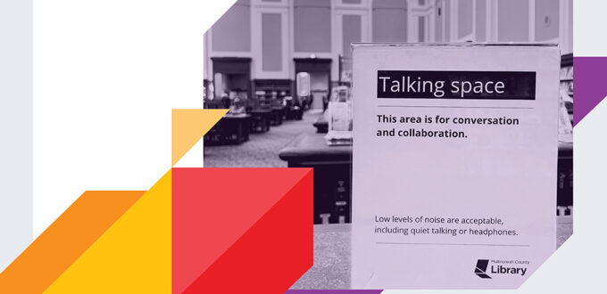
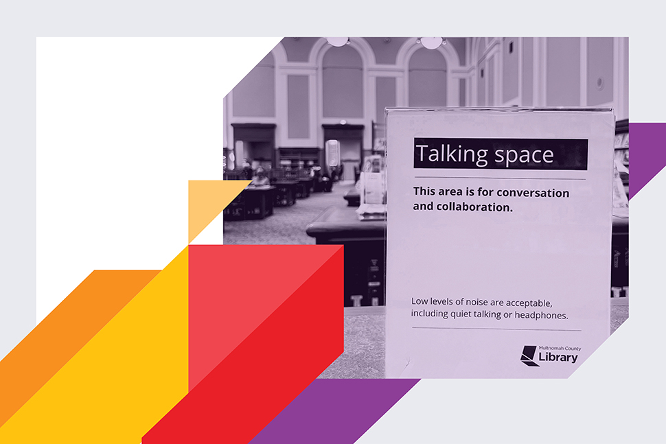
Textual and visual consistency may reduce user anxiety and confusion. Prepare a signage policy that includes a design template, style guidelines, and a set of controlled vocabulary. The policy should specify which terms to use when. Quiet, silence, and soft conversations, for example, mean different things, and if used synonymously, they can cause misunderstandings. For familiarity and clarity, use the same consistent design and terms across all promotional and communication channels, such as library brochures, websites, annual reports, newsletters, and social media messages.
To ensure this consistency, library signage should be planned, evaluated, designed, and implemented by a small committee or working group. The expression “too many cooks spoil the broth” is very true when it comes to library signage.
Design for ADA compliance. ADA concerns must be considered in any signage design project. In “Sign Redesign: Applying Design Principles to Improve Signage in an Academic Library,” a 2014 article in the journal Pennsylvania Libraries: Research and Practice, Sheila Kasperek specifically focuses on how to use ADA compliance standards to create well-designed, accessible signs. She discusses color and typeface contrast, color schemes, serif versus sans serif font, alignment, placement, logo design, viewing distance, repetition, and composition.
Kasperek describes three elements of ADA-compliant design: contrast, alignment, and repetition.
- ADA compliant signs should have at least 70% color contrast. Signage in low-lighting areas needs even higher contrasts: Adjacent colors must be significantly different from each other in low-light situations. For consistency, your signage template should include the RGB (red, green, blue) or HEX (hexacode) numbers for each of the colors used. Font size contrast is also important: The title section of the sign should have a larger font size than the other sections of the sign.
- Alignment is how text and images are placed on the design canvas. There are psychological differences in how users perceive centered content versus left- or right-aligned content. Titles or headings should be aligned to center, and secondary content should be aligned left or right. Alignment also covers bulleting (or chunking) text, which can help with readability.
- Repetition is the repeated use of text or images in a particular sign. Repetition can help reinforce the sign’s message, but don’t go overboard; too much repetition may annoy readers or cause them to tune the sign out.
Place signage with purpose. For maximum effectiveness, signs must be located strategically. What’s most important: Signs should be placed where users make decisions. These points should be determined through user research. Consider creating a signage locator map, which marks the most effective places to mount or display signs to reach the largest audience.
Vary sign design to fit location, which determines how users will engage with the sign. Waiting areas, such as the line for the circulation desk, are suited for point-of-wait signs; these signs should contain more text because users will engage with the sign for longer periods of time. For high-traffic areas, point-of-transit signs are appropriate; these should be highly visual and contain little text because users will probably not stop to read the sign. Promotional or informational signs should be placed in clear sightlines so library users can see them from a distance.
Signs must be placed at a height where most viewers can read them, and the font size should vary with how far the sign is from the viewer. The font size-to-viewing distance ratio is approximately one inch of font height for every 10 to 12 feet of viewing distance. (Text that is one inch high corresponds to 72-point font.)
Other considerations
The number of signs matters. Having fewer helps avoid visual noise. Sometimes, an overabundance of signs produces inconsistencies; when new signs are simply added on top of existing ones, it can be confusing or contradictory. When library workers create too many signs, the signage becomes overwhelming and ineffective.
Compounding the problem is the fact that these signs are often negative. The overload of signs expresses library workers’ frustration with users who break policies (like “no eating in the library”). Sometimes, these workers create signage that scolds users. Similarly, when workers are frustrated with repeated directional questions, they create signs to deflect them—and their frustration comes through. While a lack of signage may result in more reference questions, confusion, and user anxiety, too many signs can result in an environment that is aggressive, unwelcoming, policing, lacks focus, and can cause too much visual noise.
Revisit your signs often. Signs are living documents that require continuous assessment and revision. Signage systems should not be left to run on autopilot. Keep tabs on your library users’ changing needs and ways of using the library. Run periodic research with users, have library workers unobtrusively observe users to assess how they engage with signs, and stay aware as your library’s pathways and decision points change. A monthly sweep of the library’s sign locations can be a useful check-in to see if signs are clean, in good condition, and in their appropriate places. Reassess signage placement, height, visibility, and sightlines, and check for any new barriers to users seeing or using each sign.
Signs should be professionally designed. When you look for a signage company, check whether they are a member of a professional signage association, such as the International Sign Association or the US Sign Council Foundation. There are full-service signage companies that can survey the physical environment and design, develop, and install your signage. (If you use this type of full-service company, however, you should still conduct user research with your patrons. Most sign companies do not offer this service.)
Signage companies have different specialties: Some provide custom-built signs, catering to a niche market such as small businesses, while others produce mass quantities of indoor or outdoor signs for larger businesses, like chains of hotels or restaurants. If you are unsure which company would be the best fit for your project, there are sign brokers and signage consultants who act as liaisons between you and the signage company. If you choose a signage company that simply manufactures signs to your specifications (not a full-service company), these signage consultants can provide guidance on large-scale signage projects and redesigns.
Create a signage policy. It is good to have a document that records the specific parameters of your library’s signage, which are chosen during a signage audit for usability, consistency, and branding. The document provides guidelines for style, design, typeface, color schemes, sizing, placement, and the management of the library signage system. It includes a controlled vocabulary, design templates, and image files of your library’s logo. It names the stakeholders involved with signage, including the members of the committee or working group that makes decisions about signage. Finally, it lays out processes and schedules for auditing and maintaining all library signage.
Source of Article